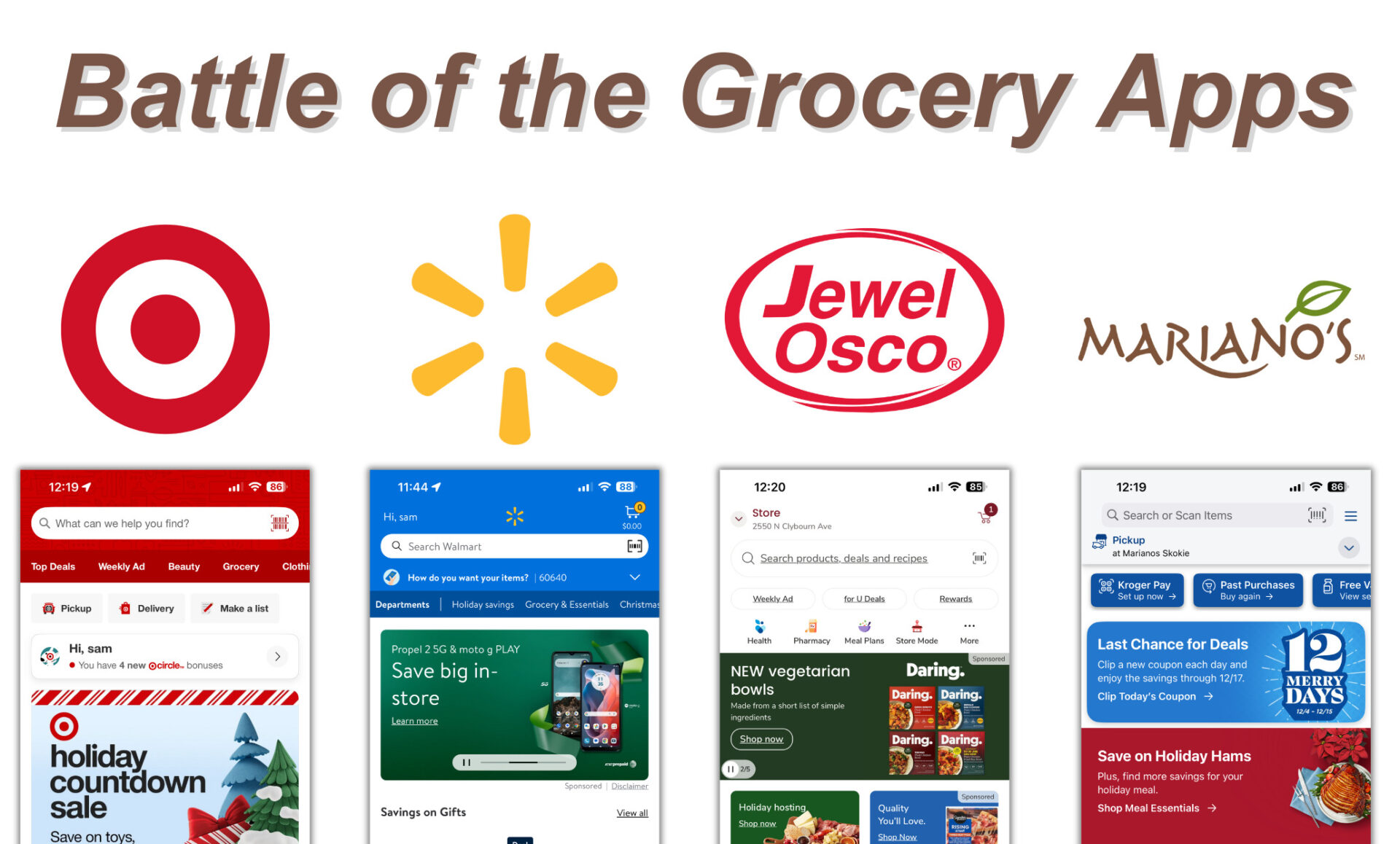
As someone who goes to the grocery store multiple times a week, my biggest pet peeve related to grocery stores are their (sometimes) janky apps. There’s nothing worse than driving 30 minutes to a specific store to find a specific product that said it was in stock on the app only to get there and find out they’re out of stock. Or you can’t find the aisle it’s in. Or they don’t have the color. Or…you get my drift.
This post will be my personal review of grocery store apps from a UX perspective, so let’s get into it!
NOTE: these are based off of app updates as of Fri, Dec 13, 2024.
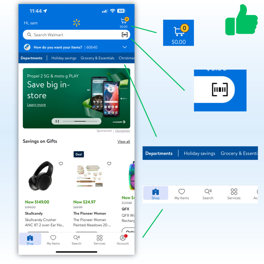
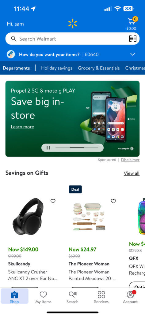
App #1: Walmart
First Impressions:
- Simple and clean.
- Brand recognition colors and logo at top.
- Home screen has most important features (Account, cart, search)
- Interesting that brands can sponsor their products on the home page (not sure if this is a positive or negative yet)
- Departments and categories in the header, easily accessible
- Barcode scanner: This is a fairly recent feature in most apps. Great if an item is on the wrong shelf, allows you to scan an item and get the right price.
- Navigation bar is clear, concise and has the most important features.
Improvements that could be made:
- Separate the items in the “Savings on Gifts” section more clearly by adding a border, container or background to the photos
- The text under the title of items feels redundant
- Walmart+ pop up as soon as you open the app. No option for “don’t ask me this again.”
Overall rating: 6/10
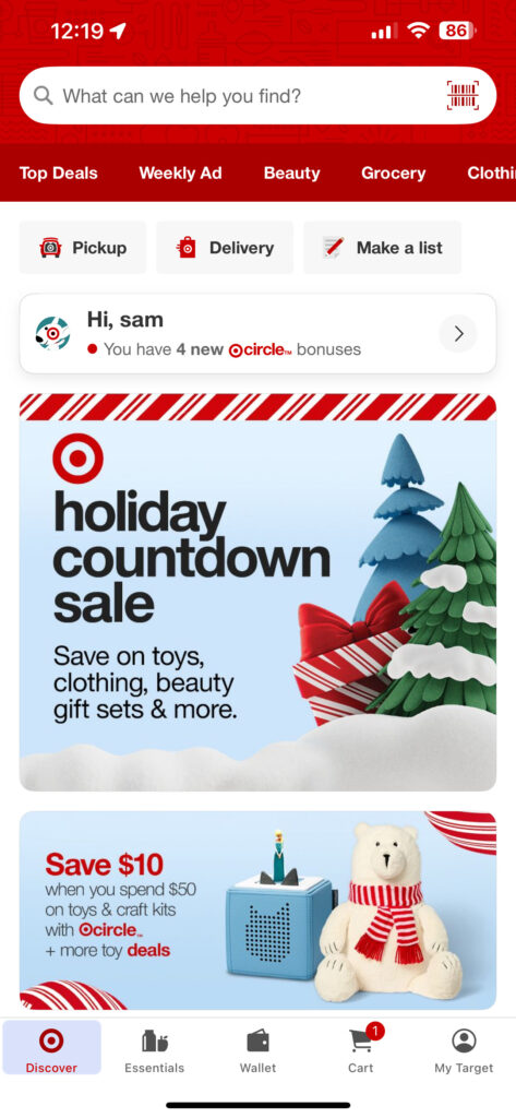
App #2: Target
First Impressions:
- Everything is cleanly separated with containers and round edges. Gives a cozy, soft feel.
- Strong brand presence with the signature Target Red color.
- Navigation bar menu simple
- The You have 4 new Circle bonuses container is slightly raised with a shadow, making it stand out but only subtly.
Improvements that could be made:
- Circle deals at the top and in a container at the bottom feels redundant. Could use that space better.
Overall rating: 9/10

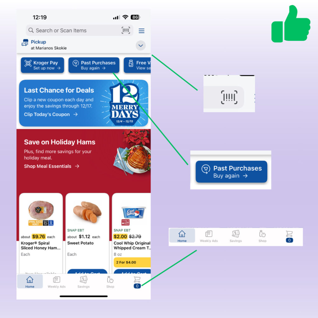
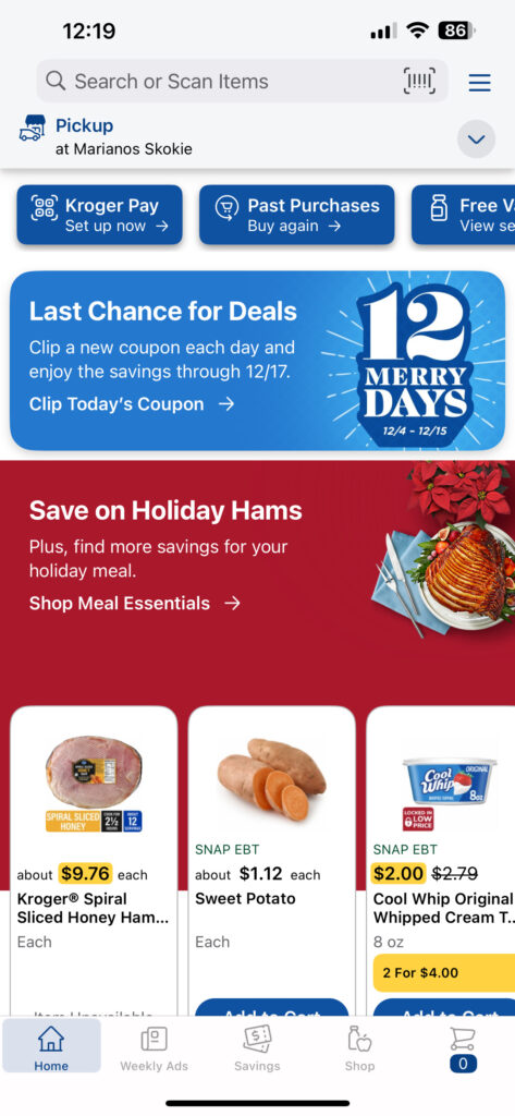
App #3: Marianos
First Impressions:
- A bit overwhelming with all of the colors and text. Too much visual clutter.
Improvements that could be made:
- “Kroger Pay” at the top could confuse consumers who do not know that they own Marianos
- There’s no Marianos logo or likeness on the home page of the app. Would not know this was the app other than seeing the store name below Pickup.
- The weekly ads and savings tab seems redundant. Both lead to pages where you can see deals. A simple “Deals” tab would suffice.
- Add Mariano’s brand colors
Overall rating: 4/10
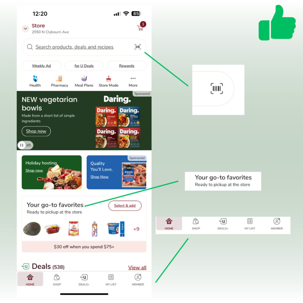
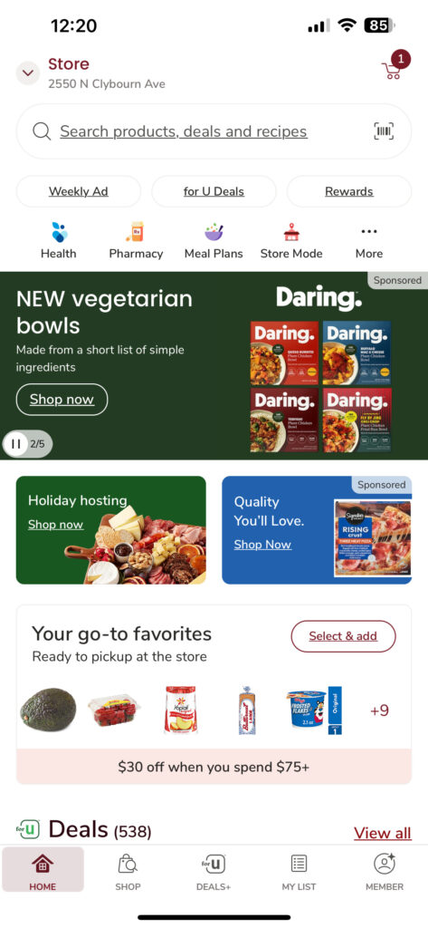
App #4: Jewel Osco
First Impressions:
- A lot on the home screen.
- A go to favorites list helps users quickly shop for their recently purchased items
Improvements that could be made:
- Logo added to the home page so that it’s known this is Jewel Osco’s app.
- Keep it to one sponsored item on the page
- The “$30 off when you spend 75+” should be at the top as a banner or highlighted better.
- Would be great if the sponsored post was related to something I would eat.
Overall rating: 5.5/10
From a UX perspective
What they all do well:
- Departments and categories in the header, easily accessible
- Barcode scanner: This is a fairly recent feature in most apps. Great if an item is on the wrong shelf, allows you to scan an item and get the right price.
- Navigation bar at the bottom is clear, concise and has the most important features. Also current screen is highlighted when selected.
- Use both sharp and rounded borders
My personal comments
My favorite app hands down is Target:
- Has an interactive store map and aisle # under each item.
- Can easily order items for pickup and add a substitute item.
- Lots of reward bonuses such as spend $xxx on qualifying purchases x time to receive a $xx gift card.
- $10 off $50 deals weekly
- Can pay through the app with a virtual bar code
- Can shop past orders based off things you commonly buy
- Has a top items list
- All deals usually have a bold noticeable red font
